
In full disclosure, at the moment, I (thankfully) do not need knee surgery. But I might easily need it someday. I run a lot, my neighborhood is very hilly, and I come from a family with weak bones and prone to osteoarthritis. My mom needs knee surgery, in fact, but she is a life-long Kaiser member, and since all Kaiser hospitals are more-or-less the same(at least with respect to cost and quality), you pick whichever one is closest – perhaps second closest if it you can avoid crossing a bridge or sitting in freeway traffic.[1]
But outside of the Kaiser bubble, it’s the wild west. Most people who read this blog are familiar with those mind-boggling studies showing that two hospitals across the street from each other vary in price three-fold even though their outcomes are exactly the same. I wanted to see how price variation and the disconnect between cost and quality play out in my own backyard, and the Sage Transparency tool finally makes exploration feasible.
Through the efforts of the Employers Forum of Indiana, with technical support from Mathematica and funding from Arnold Ventures, the Sage Transparency database brings together public and private data sources to provide a customizable lens into hospital value. The database, which launched in May 2022, comprises pricing data from the RAND Hospital Price Transparency study, Turquoise Health – which scrapes the pricing data that hospitals are required to post in compliance with the Federal Hospital Price Transparency rule, and the National Academy for State Policy Makers (NASHP)’s Hospital Cost Tool, which compares hospitals’ commercial billed charges to their actual costs of delivering services. On the quality front, Sage Transparency provides hospitals’ Medicare Starsscores, in tandem with quality indicators of overall hospital quality, medical quality, and surgical quality from Healthcare Bluebook’s Quantros database.
The Sage Transparency tool offers multiple lenses for evaluating hospital value:
- The Hospital Directory tab provides comprehensive profiles of individual facilities, benchmarked against state and national averages;
- The Hospitals by System tab displays cost and quality data for all facilities within a given health system, even those that operate in multiple states;
- The Hospitals by State tab ranks hospitals by price and quality across the entire state and offers national benchmarks for comparative purposes;
- The Clinical Categories tab allows the end-user to compare prices for 16 specific care categories, with filtering options by state and region; and finally
- The State tab provides a national comparison of prices by state, parsing by site of service (inpatient, outpatient, physician, etc.)
My quest for the optimal hospital for my hypothetical knee surgery began on the “Clinical Categories” tab, where I selected the clinical category “orthopedics” my state, California, and my metropolitan service area: San Jose-San Francisco-Oakland.[2] Of the 60+ hospitals in my region that offer orthopedic surgery, 24 have available pricing information, cited as a percentage of Medicare. Because I am not particularly attuned to hospital geography in the Bay Area, I turned to Google Maps to help me figure out which of these 24 hospitals was within a 20-mile radius of my residence in the East Bay. This significantly narrowed the playing field down to 5 hospitals: 4 in San Francisco and one in Berkeley.
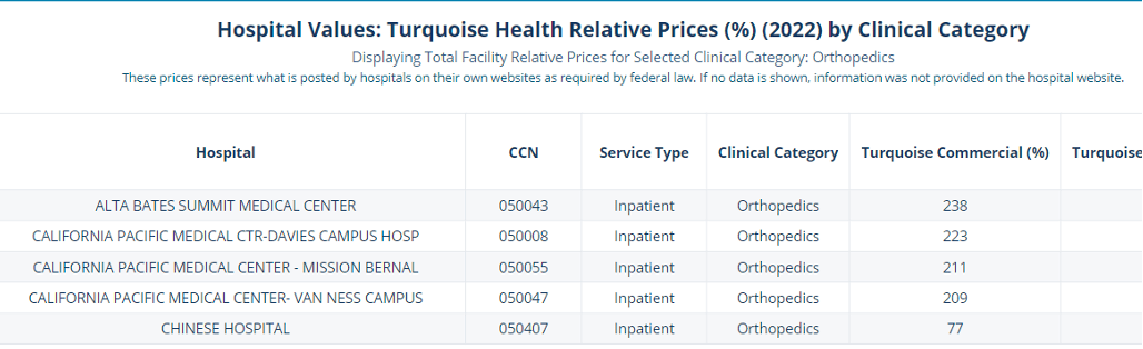
The pricing data show that the cost of an orthopedic procedure within a 20-mile radius of my location ranges from 77% of Medicare to 238% of Medicare. That’s quite a spectrum! But while price is important, I don’t want to sacrifice the quality and safety of my hypothetical knee surgery. So, the next step was to check the quality measures for these hospitals, using Sage Transparency’s Hospital Directory tab.
This tab profiles each hospital individually – here’s what the profile looks like for Alta Bates, the first hospital on my list:
![]()
![]()
For comparison purposes, I compiled the quality and price scores for all 5 hospitals into a single table – see below:
|
METRICS |
Alta Bates |
CPMC – Davies |
CPMC – Mission Bernal |
CPMC – Van Ness |
Chinese Hospital |
|
|
COST METRICS |
Orthopedic Commercial Price (% Medicare) |
238% |
223% |
211% |
209% |
77% |
|
Total Facility + Physician Price(% Medicare) |
227% |
297% |
300% |
364% |
125% |
|
|
NASHP Break Even Ratio |
210% |
100% |
435% |
147% |
283% |
|
|
QUALITY METRICS |
Patient Experience |
3/5 |
3/5 |
3/5 |
3/5 |
3/5 |
|
Medicare Stars Rating |
4/5 |
3/5 |
4/5 |
3/5 |
3/5 |
|
|
Hospital Quality (Quantros) |
63.1% |
48.1% |
67.5% |
32.6% |
70.1% |
|
|
Medical Care Quality (Quantros) |
88.0% |
56.5% |
48.8% |
20.3% |
56.5% |
|
|
Surgical Care Quality (Quantros) |
77.2% |
68.2% |
83.6% |
79.9% |
87.3% |
|
Takeaway: Chinese Hospital has high quality and BY FAR the lowest prices
It does not surprise me that Alta Bates and the California Pacific Medical Center (CPMC) campuses have commercial prices that are approximately 3x higher than the one independent hospital (Chinese Hospital) in this sample. Alta Bates and the CPMCs are all part of Sutter Health, which dominates the Northern California health care market, and the subject of a recent antitrust lawsuit brought by the state for its monopolistic, anticompetitive tactics. It is striking, however, that Chinese Hospital charges only 77% of Medicare (in San Francisco?!) and has the highest surgical quality of all five hospitals per its Quantros score.
It’s also interesting to observe the variation within the same hospital system (CPMC). While the prices seem more or less comparable, the differences in quality scores are astonishing. CPMC Van Ness scores only 20% for medical quality and 33% for hospital quality? Gah! That’s a little scary. And given that prices are almost identical between the Davies and Mission Bernal campuses, why is Mission Bernal’s break-even ratio 4x higher than the Davies campus? Maybe it’s payer mix, or risk scores? Perhaps one is a teaching hospital? Impossible to know without further research or inside baseball knowledge, but it doesn’t matter because based on the results of my research, Chinese Hospital is the place I should go for my hypothetical knee surgery, right?
Well…not so fast.
Because if this is me doing the hospital-shopping, there’s another element I want to factor in: what is my out-of-pocket cost? The prices listed within the Sage Transparency tool describe what a health plan will pay – not me. And if I am in a flat co-pay plan, or if my out-of-pocket maximum is low, then why should I care if my health plan has to pay three-times as much for my knee surgery? Anyone who has spent any time on the East side of the SF Bay and braved the traffic getting in and out of the city will understand why it’s very tempting to pick the high-quality, high-cost hospital if it’s no skin off my nose!
This raises a broader point that tools like Sage Transparency are most useful for purchasers and policy-makers, and is not intended for individual consumer shopping. If I were a purchaser using Sage Transparency, I might look at this data and design my benefits such that someone like me would be willing to endure the bridge traffic and bypass the high-cost hospital in my backyard. Maybe I’d also consider kicking one of the high-cost, low-quality hospitals out of my network.[3] And if I were a state regulator or part of a licensing/accreditation body, policy-maker, I’d be very curious about the cost/revenue ratios at the CPMC campuses and would want to understand why some of their quality scores are so dismally low.
This entertaining data spelunking expedition leaves me with the following takeaways – all of which, for the record, confirm the priors that CPR has touted for years:
- Price variation is real and seemingly arbitrary, with no apparent coordination to quality nor the cost of care delivery;
- If I were shopping for knee surgery, there’s more research I’d need to do, such as researching the price of the actual procedure I need, the negotiated rate for my specific health plan, and figuring out what my total out-of-pocket costs would be; and as such:
- Tools like Sage Transparency and the sources that feed it offer tremendous value to purchasers and policy-makers, but are not intended for individual health care consumers, whose motivations and incentives include elements of convenience and familiarity in addition to price and quality.
[1] Side note: I had a baby at a Kaiser Hospital in 2009 and had a birth plan that included three different Kaiser Hospitals, leaving the final decision contingent on what time of day the baby chose to arrive, and which direction traffic was flowing.
[2] A note to anyone who doesn’t live in the Bay Area: The distance from my house to San Jose is about the same as the distance from Chicago to Kenosha, but the traffic is much worse. I can actually leave my house, drive to the airport and fly to Los Angeles in the same time that it takes me to drive down to San Jose during rush hour.
[3] Although one of the problems with Sutter Health, and one of the reasons they’re embroiled in antitrust litigation is because of their all-or-nothing contracting clauses that prohibit carriers from excluding any single Sutter facility from their networks.
CPR’s Director of Projects and Research, Julianne McGarry, MPP, wrote this blog post.